Site MagniFinance
Redesign of MagniFinance's website with the goal of increasing website conversion.
The Initial Problem
The project to redesign the website arose from the need to improve lead generation and conversion. From a design perspective, the previous website had various visual inconsistencies due to multiple changes made over the years. This resulted in a lack of visual unity and several aesthetic issues, possibly undermining our credibility and creating a perception that the product was unprofessional. Additionally, the website also had a poor ranking on Google.
Research
I started the project by conducting benchmarking research to understand our weaknesses compared to the competition. Additionally, I revisited and updated our buyer personas, empathy maps, and customer journeys, ensuring a higher level of empathy with the desires and expectations of our leads.
I analyzed our analytics data and interviewed the customer success team to identify the level of understanding leads had about the product, as well as their main doubts and difficulties in understanding the concepts and processes we offered on the platform.
The 5 Main Problems with the Old Homepage and Proposed Solutions:
Problem 1: Very high bounce rate:
The number of people who opened the site and closed it without any interaction within a few seconds was large. We were losing many leads due to failing to spark interest for navigation.
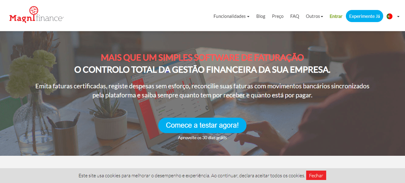
- Solution to Problem 1 -> Reduce site header and focus more on features:
 Our site was relatively fast, so speed was not the reason for the high bounce rates. However, upon opening the previous site, the user encountered a menu, two sentences attempting to summarize what the platform was, and a call to action for registration. All features were initially hidden due to the large header size, requiring scrolling to view our features. To solve this problem, we reduced the header size, making these features visible as soon as the site was opened. Some large images (videos) of the platform's features, partially visible, were meant to inspire curiosity.
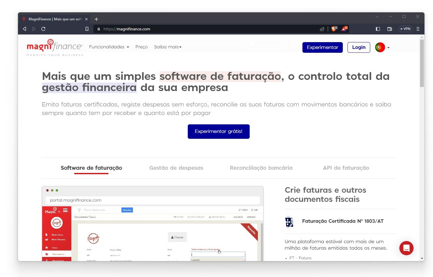
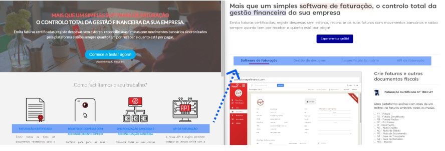
Problem 2: Low navigation to key features
 The explanatory content about the solutions we offered, such as invoicing, expense management, bank reconciliation, and API, on the homepage was very brief and did not attract enough attention to be read. Just an icon accompanied by small font text, besides being visually poor, did not provide a clear understanding of the subject. Apparently, it did not spark enough interest in the lead to make them access the specific feature pages. This lack of clarity in communicating the product and its features made it difficult to understand what we offered.
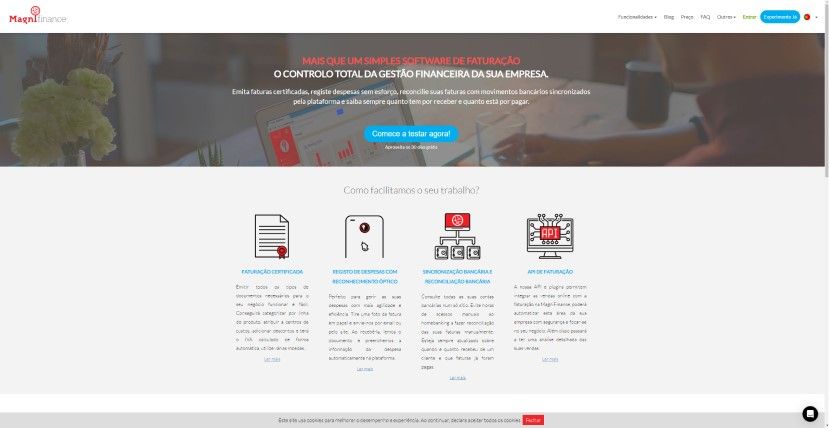
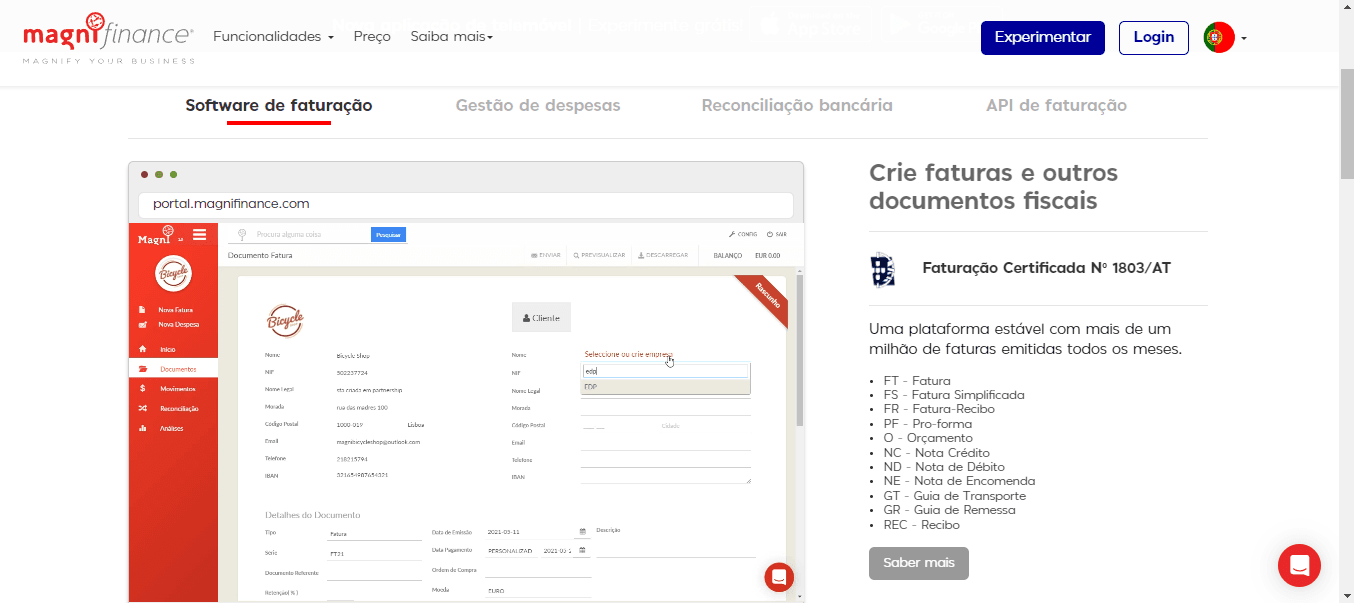
Solution to Problem 2 -> More space for key features
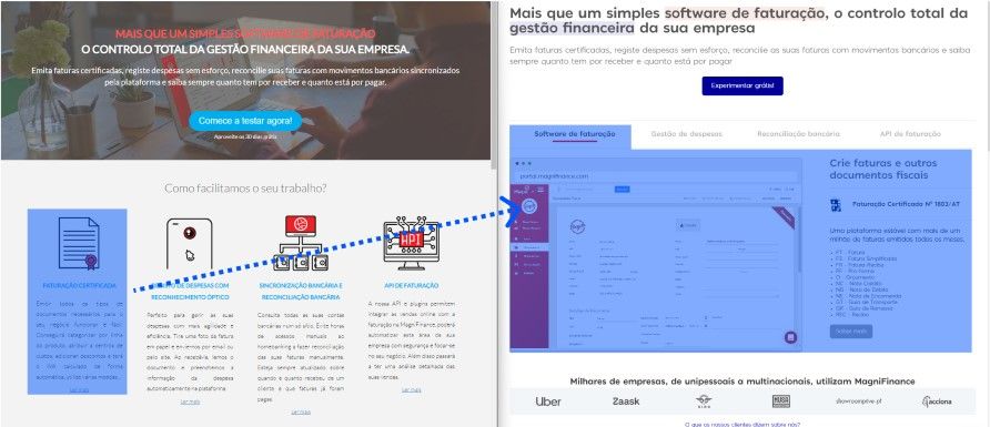
We made a change in how the features were presented. Instead of showing four small blocks containing only icons and concise texts, we opted to show one content block at a time, organized in tabs. This approach allowed us to increase the space dedicated to each content block and draw more attention to each feature. Additionally, the feature images were videos showing the platform's usage, and with more available space, we could add more information about each one, making the experience more informative and easier to understand the offered features.
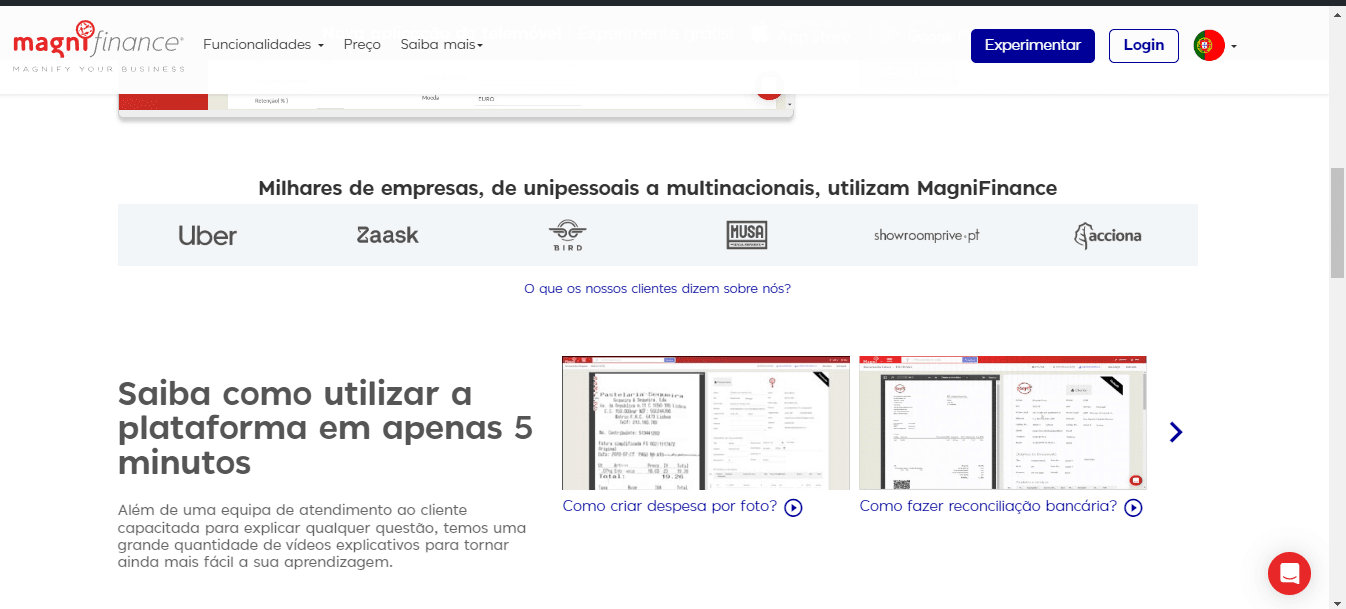
Problem 3: We did not generate trust in the lead:
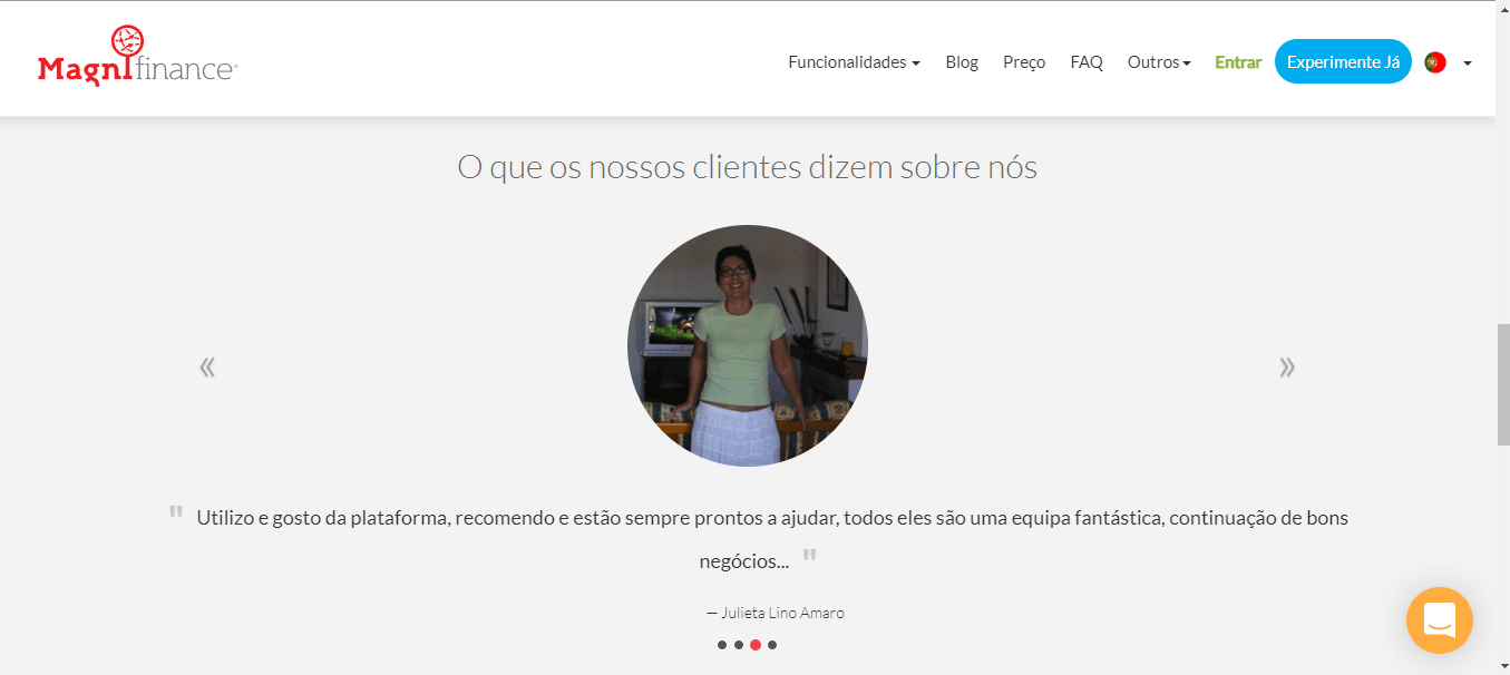
Although the company had many reviews on social networks and Google, and well-known clients such as Uber and SGS, we did not use this to help generate trust in site visitors. We had only five reviews on the page, which conveyed little credibility, and there was no way to verify the authenticity of the testimonials.
Solution to Problem 3 -> Show proof of trust and respect
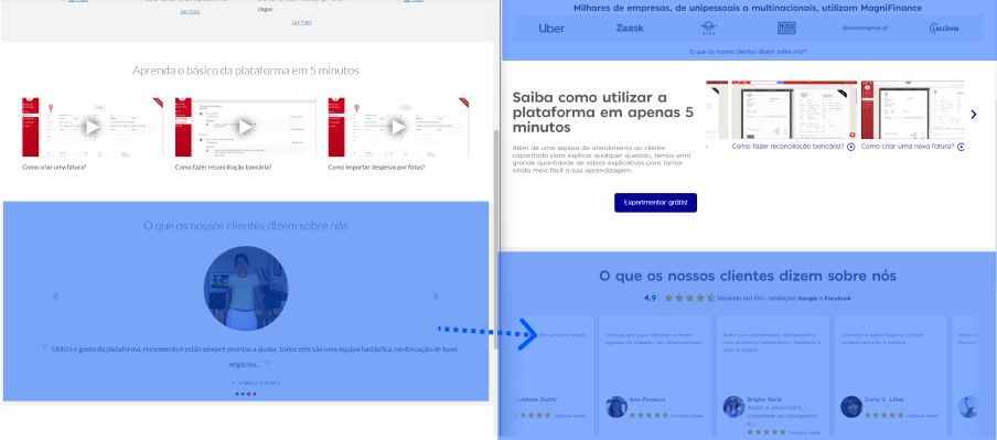
In the new version, we increased the number of reviews to over 30 and created an animated wall to display them. When hovered over, the animation stopped so they could be read, and we also included references to where these comments came from with links leading directly to the review. We added the Google and Facebook review ratings with links so they could verify their authenticity...
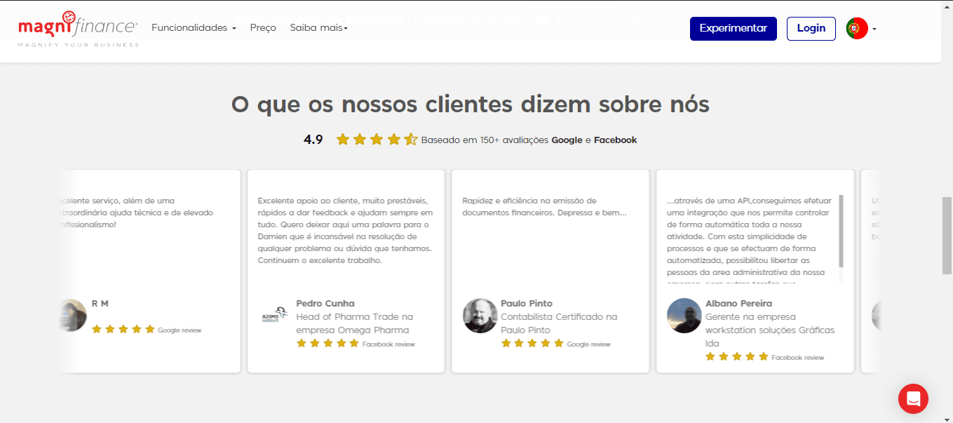
...and also started displaying logos of well-known clients like Uber, SGS, among others, to highlight them at the top of the page.
Problem 4: Visually poor and unprofessional site:
Some content was outdated and of low quality. Examples: low-resolution images, a video of the CEO at an old event with poor audio and video quality, and articles from 2016.
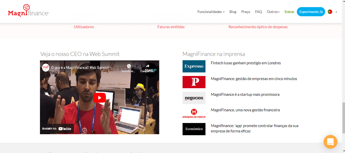
Solution to Problem 4 -> More attractive, cheerful, and professional images
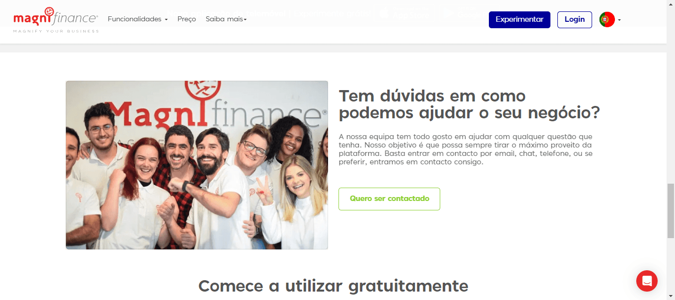
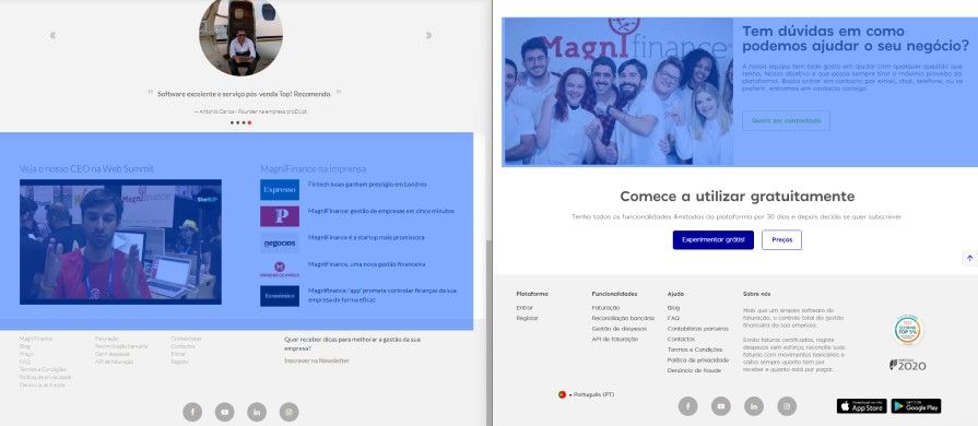 We changed this to an image showing our team, to show that we are a medium-sized company with young and diverse people. We also aimed to create more proximity and show that we have people on the other side of the screen.
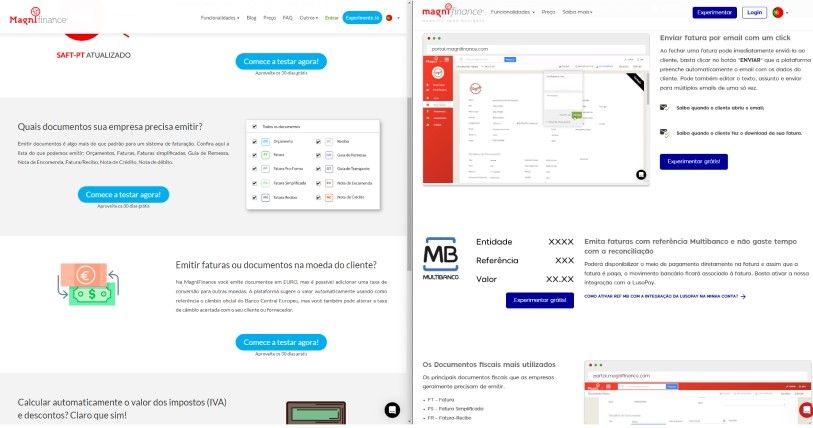
Redesign of Feature Pages
On other pages, we increased the sales arguments. On the invoicing page, for example, the list of features built in collaboration with the Customer Success department allowed us to highlight the platform's value much more. Before, we had only five sales arguments, whereas in the new version we added 15 with a more detailed explanation of the value of each one.
Results
The results of the changes were felt shortly after the launch, as we saw an increase in conversions from the website.
Taking as an example the invoicing pages (left side) and expense management (right side)...
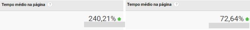
...there was a significant increase in the percentage of time the visitor stayed on the page compared to the same month of the previous year. In other words, we managed to capture visitors' attention and increase engagement on the site.
I mention only this positive behavioral metric, which can be directly attributed to the site's improvement. Other metrics such as Conversion and Bounce Rate were influenced by new AdWords campaigns that were also changed. Therefore, it is not possible to attribute the increase in these rates to the new site.
Learnings
I consider this project very enriching from the perspective of involvement and co-creation with other people in the company.
I highlight here the importance of involving the entire team in the process of identifying problems and choosing challenges, as through these dynamics with other departments, we achieved much greater involvement and commitment from the entire company. I am proud to have led this process.
Note: The new website project also included the brand redesign, which was carried out by me. However, it is not my area of expertise. Here is a blog post published on the MagniFinance website about the topic.